Illuminating Products: Mastering Light Color Temperature For Perfect Photography

Illuminating Products: Mastering Light Color Temperature For Perfect Photography

Posted on

Illuminating Success: Mastering Light Color Temperature for Product photography

Product photography is the silent salesperson, the visual ambassador that bridges the gap between a potential customer and the tangible product. The right image can evoke desire, build trust, and ultimately drive sales. But achieving that perfect shot requires more than just a good camera and a beautiful product. One crucial element that often gets overlooked is light color temperature. Understanding and manipulating this aspect of light can dramatically impact the perceived quality, accuracy, and appeal of your product images.

  • What is Color Temperature?
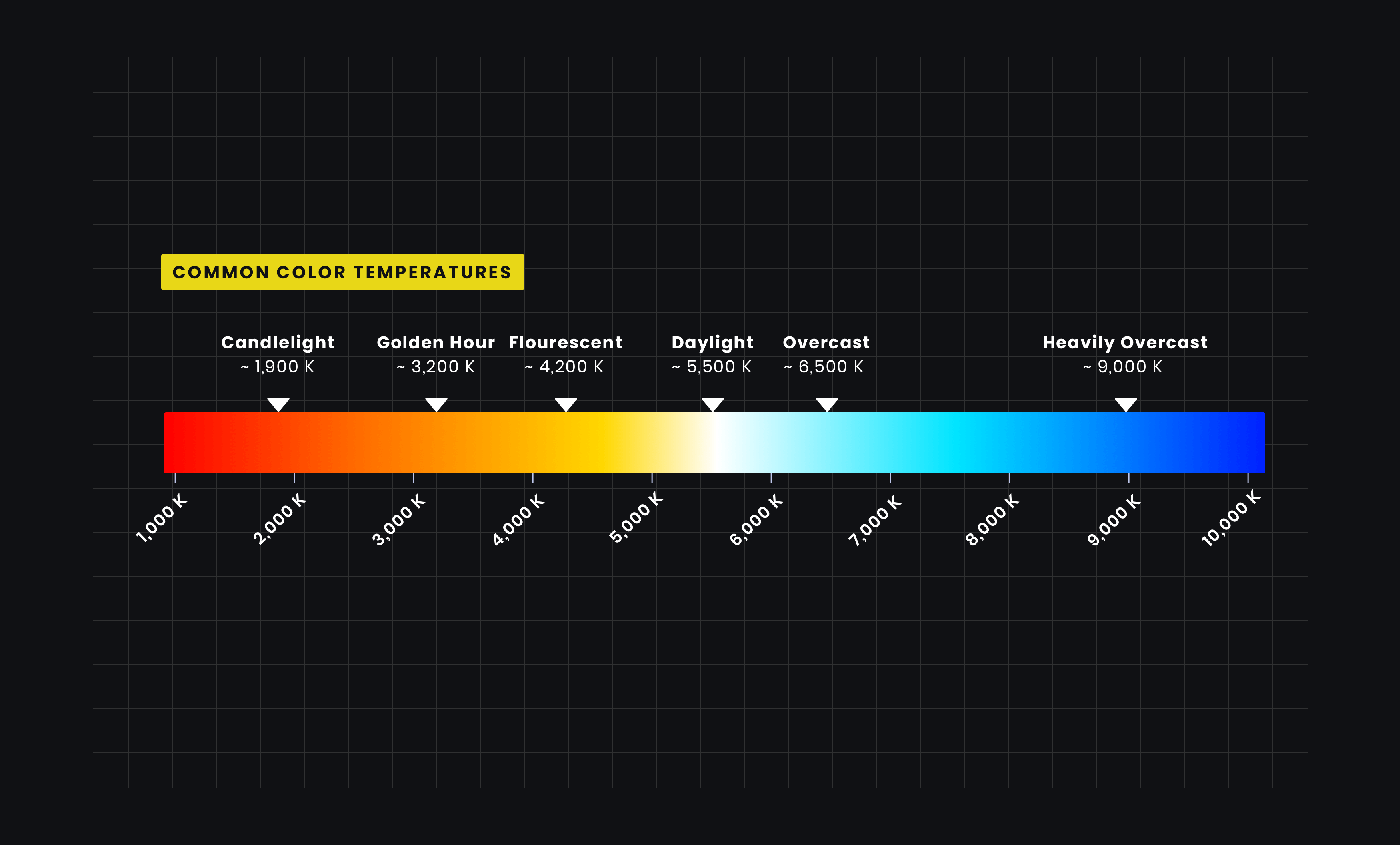
  • Color temperature, measured in Kelvin (K), describes the color tint of a light source. It’s not about the actual temperature of the light, but rather the color it appears to emit. Think of it like this: a low Kelvin value (around 2000K) corresponds to a warm, reddish-yellow light, similar to a candle flame. As the Kelvin value increases, the light shifts towards a cooler, bluer tone, resembling daylight (around 5500K) or even overcast skies (7000K+).

    Illuminating Products: Mastering Light Color Temperature For Perfect Photography
    Light Color Temperature in Product Photography
  • The Importance of Color Temperature in Product Photography
  • The color temperature of your light source directly affects how the colors in your product are rendered in the final image. Using the wrong color temperature can lead to:

    Color Casts: Your product might appear to have an unwanted tint, like a yellow cast under warm light or a blue cast under cool light.
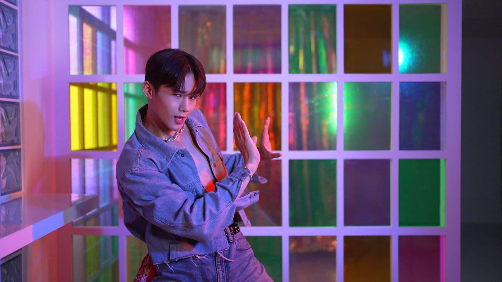
  • Inaccurate Color Representation: The true colors of your product might be distorted, leading to customer dissatisfaction when the physical product doesn’t match the online image.
  • Mood and Atmosphere: Color temperature plays a vital role in setting the mood and atmosphere of your images. Warm light can create a cozy, inviting feel, while cool light can evoke a sense of professionalism and modernity.
  • Consistency: Maintaining a consistent color temperature across all your product images is crucial for creating a cohesive brand aesthetic and ensuring accurate product representation.

  • Understanding Common Color Temperatures
  • image.title
    Epic & Exclusive Light Color Temperature For Product Photography

    To effectively utilize color temperature, it’s essential to understand common values and their characteristics:

    Warm Light (2000K – 3000K)

    This range produces a warm, yellowish-orange light, similar to incandescent bulbs or candlelight.

  • It’s often used to create a cozy, intimate, or nostalgic atmosphere.
  • Ideal for products like food, beverages, and rustic or handcrafted items.
  • Can enhance the warmth and richness of certain colors, but can also create a yellow cast on lighter surfaces.

  • Neutral White/Warm White (3000K – 4000K)

    This range provides a more balanced light, with a slightly warm tone.

  • It’s often used in homes and offices, providing a comfortable and inviting atmosphere.
  • Suitable for a wide range of products, offering a natural and flattering light.

  • Daylight/Neutral White (5000K – 5500K)

    This range closely mimics natural daylight, providing a neutral and accurate color representation.

  • It’s considered the industry standard for product photography, ensuring true-to-life colors.
  • Ideal for most products, especially those where color accuracy is paramount, such as clothing, cosmetics, and electronics.

  • Cool White (6000K – 7000K+)

    image.title
    What is Color Temperature & Why It’s Important in Photo & Film

    This range produces a cool, bluish-white light, similar to overcast skies or fluorescent tubes.

  • It can create a modern, clean, and professional look.
  • Often used for technical products, industrial equipment, or products that require a sense of precision.
  • Can create a harsh or sterile look if not used carefully.

  • Choosing the Right Color Temperature for Your Products
  • The optimal color temperature for your product photography depends on several factors, including:

    The Product Itself: Consider the colors, materials, and overall aesthetic of your product. For example, warm light might enhance the richness of a wooden product, while cool light might suit a sleek, metallic device.

  • The Desired Mood and Atmosphere: Think about the feeling you want to evoke in your images. Warm light can create a cozy, inviting feel, while cool light can evoke a sense of professionalism and modernity.
  • Your Brand Aesthetic: Maintain a consistent color temperature across all your product images to reinforce your brand identity.
  • The Intended Use of the Images: Consider where your images will be used. For online marketplaces, accurate color representation is crucial, while social media images might allow for more creative flexibility.

  • Techniques for Controlling Color Temperature
  • Here are some techniques for controlling color temperature in your product photography:

    Using Dedicated Lighting Equipment

    LED Panels with Adjustable Color Temperature: These panels offer precise control over color temperature, allowing you to fine-tune your lighting to match your specific needs.

  • Flash Units with Color Correction Gels: Flash units can be modified with color correction gels to adjust their color temperature.
  • Studio Strobes with Adjustable Settings: Professional studio strobes often offer adjustable color temperature settings for maximum control.

  • Utilizing Natural Light

    Golden Hour: The warm, golden light during the hour after sunrise and the hour before sunset can create beautiful, flattering images.

  • Overcast Skies: Overcast skies provide a soft, diffused light with a cool color temperature, ideal for accurate color representation.
  • Diffusers: Use diffusers to soften harsh sunlight and create a more even and flattering light.

  • Post-Processing Adjustments

    White Balance Adjustment: Most image editing software allows you to adjust the white balance, effectively correcting color casts and fine-tuning the color temperature.

  • Color Temperature Sliders: Use the color temperature sliders to make subtle adjustments to the overall warmth or coolness of your images.
  • Selective Color Adjustments: Use selective color adjustments to target specific colors and correct any unwanted tints.

  • Practical Tips for Achieving Consistent Color Temperature
  • Use a Gray Card: A gray card is a neutral reference tool that helps you achieve accurate white balance and color representation.

  • Calibrate Your Monitor: Ensure your monitor is calibrated to accurately display colors, allowing you to make informed editing decisions.
  • Shoot in RAW Format: RAW files contain more image data than JPEG files, providing greater flexibility for post-processing adjustments.
  • Maintain Consistent Lighting Conditions: Avoid mixing different light sources with varying color temperatures.
  • Test and Experiment: Don’t be afraid to experiment with different color temperatures and lighting setups to find what works best for your products.

  • The Power of Color Temperature in Storytelling
  • Beyond technical accuracy, color temperature can be a powerful tool for storytelling. Warm light can evoke feelings of comfort, nostalgia, and intimacy, while cool light can create a sense of professionalism, modernity, and sophistication. By carefully considering the color temperature of your light source, you can craft images that not only showcase your products but also tell a compelling story.

  • Conclusion
  • Mastering light color temperature is an essential skill for any product photographer. By understanding the principles of color temperature, choosing the right lighting equipment, and utilizing effective techniques for controlling and adjusting light, you can create stunning images that accurately represent your products and captivate your audience. Remember that consistency is key, and the right color temperature will make your products shine.

    Leave a Reply

    Your email address will not be published. Required fields are marked *